 Download Free Assets
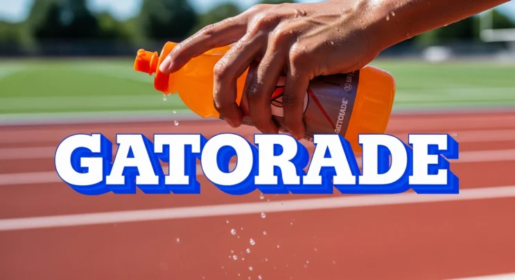
If you grew up in the 90s, you remember Gatorade everywhere- Locker rooms, NBA sidelines, Michael Jordan drenched in sweat. That bold, aggressive logo was part of the moment. And at the center of it all was the 90’s Gatorade font, a type style that screamed energy, speed, and performance.
This blog takes a close look at the 90’s Gatorade font. Where it came from. Why it worked. And why designers still chase that look today.
What People Mean by the “90’s Gatorade Font”
Let’s clear one thing up first.
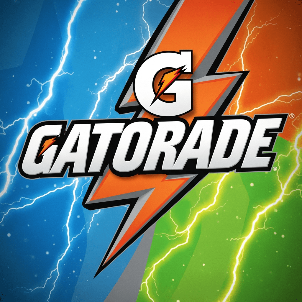
There is no officially named font called “90’s Gatorade.” What people are really talking about is the custom lettering used in Gatorade’s branding during the 1990s. This includes:
- The bold “GATORADE” wordmark
- The lightning-bolt “G” logo
- The sharp, slanted typography used on bottles and ads
This was not a standard typeface. It was a custom-designed logotype, built specifically for brand impact.
And it worked.
Visual Style: Why the Font Felt So Powerful
The 90’s Gatorade font style had a few key traits that made it unforgettable.
1. Bold and Condensed
The letters were thick and tight. No wasted space. This gave the logo a muscular feel. It looked strong. It looked athletic.
2. Sharp Angles
Many letters had hard edges and cuts. This added tension and speed. Nothing felt soft or relaxed.
3. Slight Forward Motion
The typography leaned forward. Not dramatically, but enough to suggest motion. That small tilt made a big difference. It felt fast.
4. All Caps, No Apologies
Everything was uppercase. This wasn’t a brand that whispered. It shouted.
Together, these choices made the font feel aggressive, confident, and competitive.
Why It Fit the 90’s Sports Era Perfectly
The 1990s were loud. Sports branding followed the same rule.
This was the era of:
- Oversized logos
- Neon accents
- Extreme contrast
- “Go hard or go home” design
Gatorade wasn’t selling a drink. It was selling performance. Sweat. Grit. Endurance.
The font matched that message perfectly.
It looked like it belonged on:
- Locker room walls
- Gym banners
- Championship posters
That alignment between message and design is why the font still holds power today.
The Tech and Design Context of the Time
From a modern design perspective, the 90’s Gatorade font feels almost raw. And that’s part of the appeal.
Back then:
- Digital typography tools were limited
- Vector design was improving, but not perfect
- Custom lettering was often drawn by hand first
Designers focused less on pixel perfection and more on visual punch. The Gatorade logotype was built to survive:
- TV broadcasts
- Print ads
- Product packaging
- Stadium signage
It had to work everywhere. And it did.
Fonts That Feel Close to 90’s Gatorade
If you’re trying to recreate the 90’s Gatorade vibe today, you won’t find an exact match. But you can get close.
Here are some font styles that capture the spirit:
- Compacta – Tall, bold, and aggressive
- Impact – Overused, but still carries weight
- Tungsten – Modern, condensed, and powerful
- College-style athletic fonts – Especially with sharp edges
Most designers customize these fonts. They add cuts. Adjust spacing. Sharpen angles. That’s how you get closer to the real thing.
Why Designers Still Love the 90’s Gatorade Look
Nostalgia is part of it. But not all of it.
Designers still reference the 90’s Gatorade font style because it solves a real problem: instant impact.
In a world of:
- Clean sans-serifs
- Minimalist branding
- Soft UI fonts
This style stands out.
It feels:
- Physical
- Energetic
- Unfiltered
For sports brands, fitness startups, and streetwear labels, that edge is valuable.
Modern Uses Inspired by the Font
You’ll see echoes of the 90’s Gatorade font style in modern design everywhere.
Common use cases include:
- Fitness app logos
- Esports team branding
- Gym apparel
- YouTube sports thumbnails
- Retro-themed marketing campaigns
Designers often mix the old look with modern tools. Cleaner spacing. Better scaling. Digital polish. Same energy, updated execution.
Strengths of the 90’s Gatorade Font Style
Let’s break it down.
Pros:
- Instantly recognizable
- High energy and confidence
- Perfect for sports and performance branding
- Works well at large sizes
This is not a subtle font style. And that’s the point.
Limitations to Keep in Mind
This style is powerful, but it’s not flexible.
Cons:
- Not readable for long text
- Too aggressive for corporate or tech SaaS branding
- Can feel dated if used without intention
If you use it, commit to it. Half-measures don’t work here.
Final Thoughts: A Font Style That Still Wins
The 90’s Gatorade font is more than typography. It’s a design mindset.
It represents a time when brands weren’t afraid to be loud. When sports marketing was raw and emotional. When type was meant to hit you in the chest.
Even today, that energy still works.
If your project needs strength, motion, and attitude, the 90’s Gatorade font style is still a great reference. Just update it smartly. Respect the past. Design for the present.
Because great typography, like great athletes, never really retires.