 Download Free Assets
When it comes to modern web design, UI/UX, and clean digital branding, few typefaces have gained popularity as quickly—or as widely—as Inter. If you browse tech products, SaaS dashboards, blogs, or AI tools, chances are you’ve already seen it hundreds of times.
Inter is everywhere, and for good reason.
This blog breaks down what makes Inter special, how it performs in real-world design, its strengths and weaknesses, and whether it should be your next go-to font.
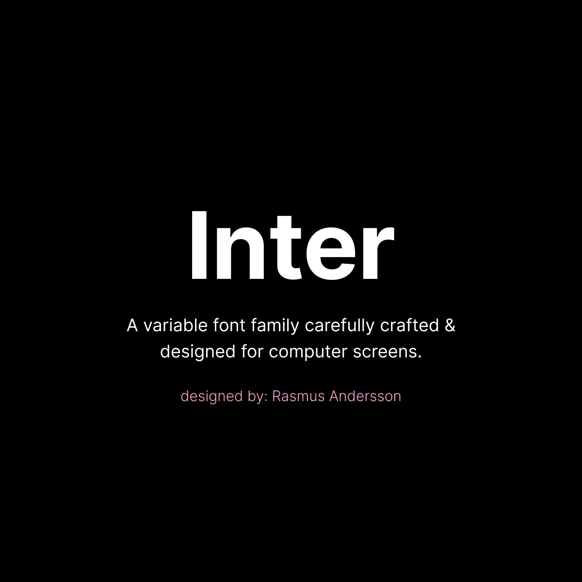
What Is Inter Font?
Inter is a modern sans-serif typeface designed specifically for screens. Created by Rasmus Andersson, a designer with a strong background in digital product development, Inter was built to solve a simple problem:
➡️ Most fonts look good at large sizes—but not at small UI sizes.
Inter was engineered to be pixel-perfect on high-density displays, making it one of the cleanest and easiest fonts to read in digital environments.
It is now widely available on:
- GitHub
- Most major design tools (Figma, Adobe XD, Sketch, etc.)
- Google Fonts
And the best part? Inter is open-source and free to use.
Why Designers Love Inter: Key Features
1. Outstanding Legibility
Inter was created to remain crisp even at 10–12px, a size where many sans-serif fonts start to blur. It has:
- Larger x-height
- Open shapes
- Balanced spacing
- Clean vertical structure
This makes it ideal for UI text, buttons, menus, forms, and descriptions.
2. Highly Versatile for Any Project
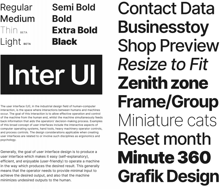
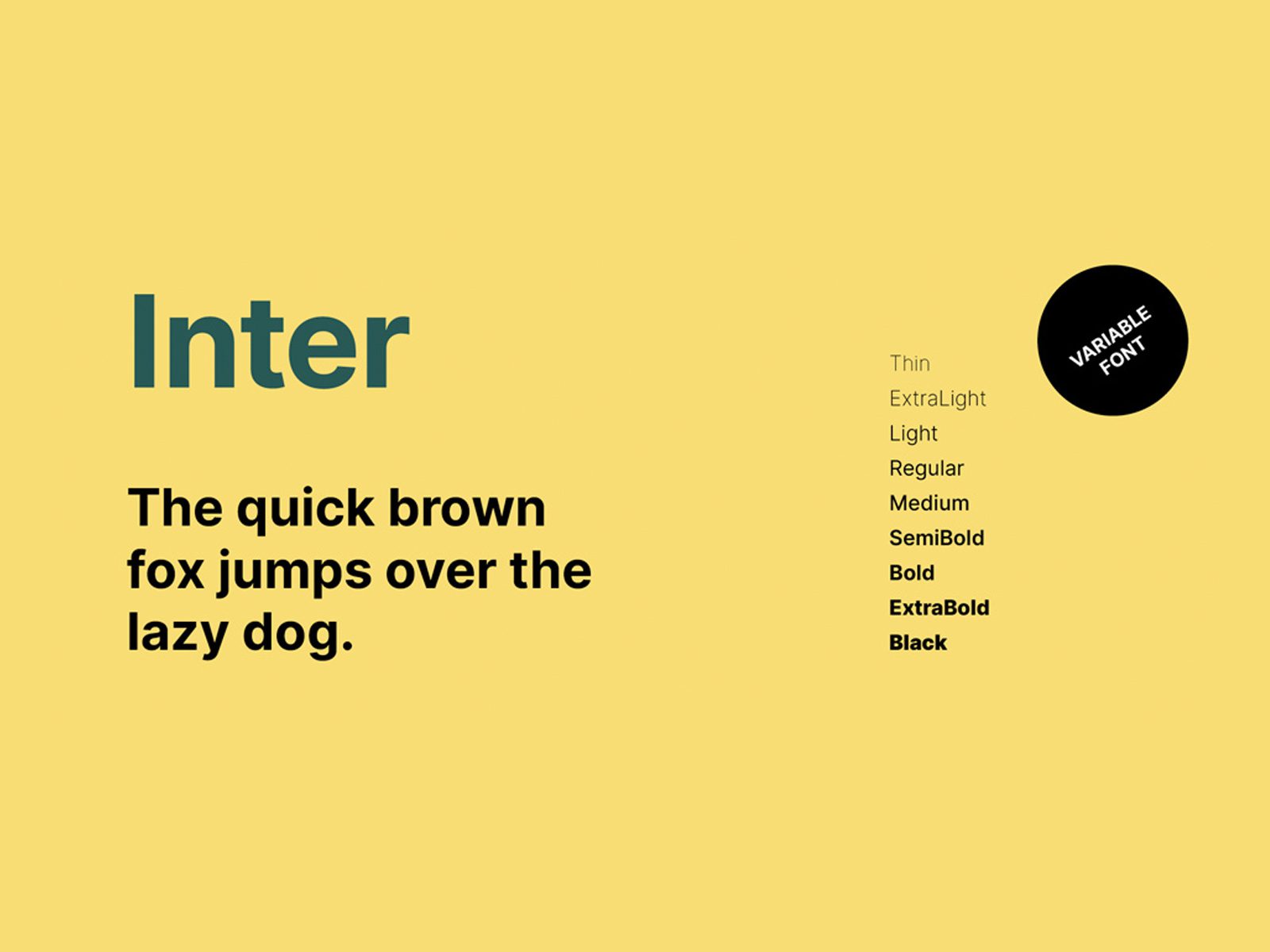
Inter includes a wide range of styles and weights:
- Thin
- Extra Light
- Light
- Regular
- Medium
- Semi Bold
- Bold
- Extra Bold
- Black
Whether you’re designing a clean website or a bold headline, Inter adapts easily.
3. Variable Font Support
Inter comes with a variable font version, allowing:
- Smooth weight transitions
- Faster page load
- Easy CSS customization
Developers especially love this feature because it reduces file sizes and improves performance.
4. Perfect for UI/UX and Digital Products
Inter’s geometry feels familiar and friendly—similar to fonts like Roboto, Helvetica, and SF Pro—but with improvements that suit modern digital environments.
It works extremely well for:
- Web dashboards
- Mobile apps
- AI interfaces
- Ecommerce platforms
- Blogs and long-form content
- Branding for tech startups
Its clean aesthetic instantly feels “tech-forward” and trustworthy.
Inter Font Compared to Popular Alternatives
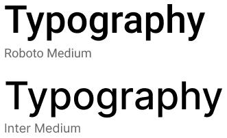
InterFont vs Roboto
- Roboto is more geometric, while Inter feels more warm and human.
- Inter has better clarity at small sizes.
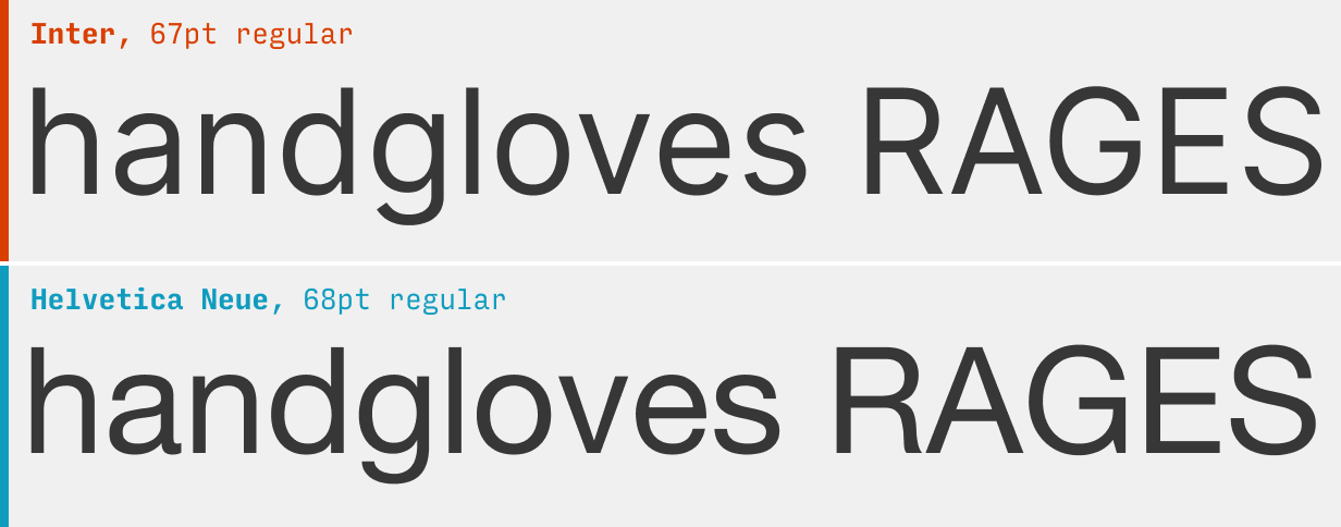
Inter vs Helvetica
- Helvetica is iconic but not optimized for digital UI.
- Inter has improved spacing for screens and variable font support.
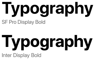
InterFont vs SF Pro
- SF Pro (Apple’s font) is extremely polished but restricted in usage.
- Inter is open-source, giving it a major advantage for free use.
Inter vs Open Sans
- Open Sans is good for body text.
- Inter outperforms in UI-heavy layouts.
Verdict: Inter offers the best balance of aesthetics, flexibility, and technical performance for digital products.
Strengths of Inter Font
✔ Exceptional Readability
Inter’s optical features make long-form reading comfortable.
✔ Free & Open Source
Ideal for:
- Startups
- Independent designers
- Agencies needing scalable, cost-free licenses
✔ Highly Professional Look
Inter feels modern, clean, and polished—perfect for tech industries.
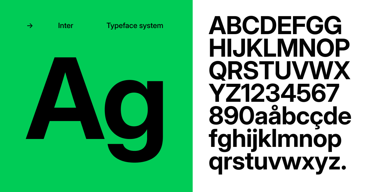
✔ Multilingual Support
Inter includes extensive character sets, covering dozens of languages.
✔ Works Anywhere
Whether it’s CSS, mobile, or print, Inter adapts seamlessly.
Weaknesses of Inter Font
❌ Overused in Tech Products
Because Inter is so good, it’s used almost everywhere.
If your brand needs to look unique or premium, Inter might feel too safe or familiar.
❌ Slightly Minimal for Creative Industries
Fashion, luxury brands, and expressive creative work might prefer more personality-driven typefaces.
❌ Works Best in Digital, Not Print
While great on screens, Inter wasn’t designed with traditional print aesthetics in mind like Garamond or Futura.
Ideal Use Cases for Inter
1. UI/UX Design
Buttons, forms, navigation, modals—Inter excels in interfaces.
2. Web Design
Its readability and modern look suit both minimal and complex layouts.
3. Tech Startup Branding
If your brand wants a clean, trustworthy, modern feel—Inter is perfect.
4. SaaS Dashboards
Its clarity at small sizes makes analytics and metrics easier to read.
5. Blog Typography
Inter is excellent for paragraph-heavy content, especially on high-resolution screens.
How Inter Performs in Real Projects
Readability at Small Sizes: 10/10
Even at 10px, Inter stays sharp.
User Interface Clarity: 9.5/10
Layouts remain balanced and easy to scan.
Brand Identity Potential: 8/10
Great for tech, less ideal for artistic brands.
Web Performance: 9.5/10
Variable font support gives it a big advantage.
Why Inter Became the Default Tech Font
Designers love simplicity. Developers love performance. Brands love accessibility.
Inter checks all three boxes.
Its balance of geometry, readability, and modern aesthetic makes it a perfect match for:
- AI tools
- SaaS companies
- Productivity apps
- Startup landing pages
It has essentially become the “new default sans-serif” for digital design.
Final Verdict: Should You Use Inter Font?
If your project is digital-first—whether it’s a website, dashboard, app, or tech startup—Inter is one of the best choices available today.
Use Inter if you want:
✔ Clean, modern typography
✔ A professional look
✔ Highly readable UI text
✔ Fast load speeds
✔ Free and open licensing
Avoid Inter if:
✘ You want a highly artistic or unique brand identity
✘ Your project is print-heavy
✘ You want something less common in tech
Overall Rating: ★★★★★ 4.8 / 5
Inter is one of the strongest, most versatile modern fonts in today’s design ecosystem.