 Download Free Assets
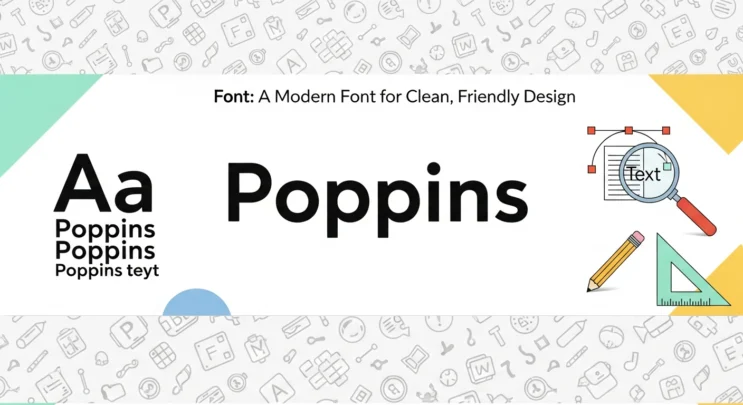
When it comes to modern typography, poppins font has earned a solid place in the designer’s toolkit. Whether you’re building a website, designing a mobile app, or working on branding materials, this geometric sans-serif font consistently delivers a clean, approachable, and highly readable look. In this review of poppins font, we’ll explore what makes it so popular, where it works best, and why designers across the creative world keep coming back to it.
What Is the Poppins Font?
Poppins is a modern geometric sans-serif typeface designed by Indian Type Foundry and released via Google Fonts. It is inspired by classic geometric fonts but updated with smooth curves, rounded edges, and a friendly personality that feels fresh and contemporary.
Unlike many sharp or rigid geometric fonts, Poppins uses nearly perfect circles in its letterforms, giving it a balanced and approachable feel. This makes it ideal for both professional and casual design projects.
Characteristics of Poppins Font
1. Clean and Geometric Letterforms
Poppins is built on geometric principles, which means its shapes are mathematically balanced and visually pleasing. Letters like “O,” “P,” and “B” feel almost circular, creating a consistent and modern look across the typeface.
2. Rounded Edges and Friendly Appearance
One of the biggest strengths of Poppins is its rounded edges. These soft curves make the font feel welcoming rather than cold or overly technical. This friendly vibe works especially well for startups, lifestyle brands, and digital products.
3. Excellent Readability
Thanks to its open shapes and even spacing, Poppins is easy to read on both desktop and mobile screens. This makes it a strong choice for responsive web design, where clarity across different screen sizes is critical.
4. Wide Range of Weights
Poppins comes with an impressive range of weights, from Thin to ExtraBold and Black. This gives designers the flexibility to use one font family for:
- Bold headlines
- Clean subheadings
- Comfortable body text
- Strong call-to-action buttons
Using multiple weights from the same font keeps designs consistent and polished.
Why Designers Love Poppins
Versatility Across Design Projects
Poppins is incredibly versatile. You’ll see it used in:
- Websites and landing pages
- Mobile apps and UI/UX design
- Branding and logo design
- Social media graphics
- Marketing materials
Its modern style adapts easily to different industries, from tech startups to fashion brands.
Perfect for Minimal and Modern Design
If your design goal is minimal, clean, and user-friendly, Poppins fits right in. It pairs beautifully with white space, soft color palettes, and modern layouts. Many designers choose it specifically for its ability to look stylish without trying too hard.
Works Well in Digital Environments
Because Poppins was designed with digital use in mind, it performs exceptionally well on screens. The consistent stroke widths and balanced proportions help prevent eye strain, especially in long-form content.
Poppins Font for Web and Mobile
In today’s design world, a font must perform well across devices. Poppins excels here.
- Web Design: Headlines stand out without feeling bulky, and body text remains clean and readable.
- Mobile Apps: The rounded shapes improve legibility on smaller screens.
- UI Elements: Buttons, menus, and labels look modern and approachable.
For designers focused on user experience, Poppins offers a great balance between style and usability.
Branding with Poppins
Poppins is a strong choice for branding because it communicates:
- Modernity
- Trust
- Simplicity
- Friendliness
Brands that want to appear innovative yet accessible often gravitate toward this font. It works especially well for:
- Tech companies
- SaaS products
- Startups
- Creative agencies
- Lifestyle and wellness brands
However, because it’s so popular, designers should be mindful of using it in a way that still feels unique.
Pros and Cons of Poppins Font
Pros
- Clean, modern, and geometric design
- Friendly and approachable feel
- Highly readable on web and mobile
- Large variety of weights
- Free and easy to use via Google Fonts
Cons
- Very popular, so it may feel overused
- Not ideal for long print-heavy documents
- Less personality compared to decorative or serif fonts
How to Pair Poppins with Other Fonts
To avoid a design that feels too plain, Poppins pairs well with:
- Serif fonts for contrast in blogs or editorial layouts
- Neutral sans-serifs for body text when Poppins is used in headings
- Handwritten or script fonts for creative accents
Smart font pairing can help elevate your design while keeping Poppins as the foundation.
Is Poppins the Right Font for You?
If your project needs a modern, clean, and user-friendly typeface, Poppins is an excellent choice. It’s especially effective for digital-first designs where readability and consistency matter most.
That said, if you’re aiming for a highly unique, classic, or editorial look, you may want to explore more expressive font options.
Final Verdict: Review of Poppins Font
In this review of Poppins font, one thing is clear: Poppins is popular for a reason. Its geometric structure, rounded edges, and wide range of weights make it one of the most reliable and flexible sans-serif fonts available today. It’s easy to use, looks great across devices, and fits perfectly into modern, minimal design trends.
For designers, Poppins remains a go-to font for creating clean, professional, and approachable digital experiences. Whether you’re designing a website, app, or brand identity, Poppins is a safe and stylish choice that rarely disappoints.