 Download Free Assets
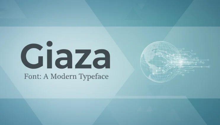
In the design world, fonts usually fall into two categories. Loud and experimental. Or safe and forgettable. Giaza font sits comfortably in between—and that’s exactly why designers keep reaching for it.
Giaza is not trying to scream for attention. It doesn’t chase trends or flex unnecessary complexity. Instead, it delivers something many modern projects desperately need: clarity, elegance, and restraint. In this review, I’ll break down what Giaza font is, how it performs, and where it truly shines—from a tech blogger’s, designer’s, and product thinker’s point of view.
What Is Giaza Font?
Giaza is a modern serif typeface designed for contemporary digital and print use. At first glance, it feels classic. Look closer, and you’ll notice subtle modern choices in spacing, proportions, and stroke contrast.
This is not a vintage revival font. It’s a modern serif built for today’s screens.
Giaza is often used in:
- Editorial layouts
- Brand storytelling
- High-end web design
- Tech and creative startups that want a “smart but human” voice
Think of it as a serif font that understands modern UX.
First Impressions: Clean, Calm, Confident
The first thing you notice about Giaza is its balance.
- Not too thin
- Not too heavy
- Not overly decorative
- Not overly minimal
It has enough character to feel designed, but not so much that it distracts from content. In tech terms, Giaza has excellent signal-to-noise ratio.
This makes it ideal for brands that want authority without stiffness.
Design Characteristics
Let’s talk about what’s actually happening under the hood.
1. Serif Style
Giaza uses soft, well-shaped serifs. They are present, but never aggressive. This keeps long reading sessions comfortable, especially on high-resolution screens.
2. Letter Proportions
The letterforms feel open and breathable. There’s good spacing between characters, which improves readability in body text and UI-heavy layouts.
3. Stroke Contrast
The contrast is moderate. This is important. High-contrast serifs can break down on smaller screens. Giaza avoids that problem and stays crisp across devices.
4. Modern Touches
Small details—like the curves, terminals, and vertical stress—give Giaza a contemporary feel without losing its editorial roots.
Readability: Built for Content
If you care about content—and tech blogs absolutely do—readability matters.
Giaza performs well in:
- Long-form articles
- Product documentation
- Landing page storytelling
- Feature sections and case studies
It holds up at small sizes and still looks elegant at larger display sizes. That flexibility is rare.
From a UX perspective, Giaza respects the reader’s eyes. That’s a win.
Where Giaza Works Best
Giaza isn’t a “use it everywhere” font. But in the right context, it’s excellent.
1. Tech Blogs and Editorial Sites
This font feels right at home on:
- Tech reviews
- Thought leadership pieces
- AI, SaaS, and startup blogs
It signals credibility without feeling corporate.
2. Brand Identity
For brands that want:
- Trust
- Sophistication
- Calm authority
Giaza works beautifully in logos, brand headlines, and mission statements.
3. Web Design
Giaza pairs well with modern sans-serif fonts. Use it for headings and editorial sections, and let a clean sans-serif handle UI elements.
Where Giaza Might Not Fit
No font is perfect.
Giaza may not be ideal for:
- Ultra-minimalist tech UI systems
- Hardcore corporate dashboards
- Playful or youth-focused branding
- Heavy data tables or dense spreadsheets
This font is about storytelling, not raw data.
Giaza vs Other Modern Serif Fonts
Compared to popular modern serifs:
- Vs Playfair Display: Giaza is calmer and more readable
- Vs Libre Baskerville: Giaza feels more modern and refined
- Vs Merriweather: Giaza is more elegant, less utilitarian
If Merriweather is a workhorse, Giaza is the well-dressed professional.
Performance on Web and Mobile
This is where Giaza quietly impresses.
- Renders cleanly on modern browsers
- Holds detail on Retina and high-DPI screens
- Doesn’t feel fragile on mobile devices
For web-first brands, this matters more than aesthetics alone.
Licensing and Availability
Giaza is typically offered under a commercial license, depending on the foundry or platform you get it from. Before using it in client or SaaS projects, always double-check:
- Web usage rights
- App embedding permissions
- Logo and branding terms
Font licensing mistakes are expensive. Don’t skip this step.
Final Verdict: Is Giaza Worth Using?
Absolutely, if your project values clarity and credibility.
Giaza is a thoughtful, modern serif that fits beautifully into today’s tech-driven design landscape. It doesn’t chase hype. It focuses on readability, tone, and trust. That makes it a strong choice for serious content creators, tech brands, and designers who care about long-term usability.
Rating: ⭐⭐⭐⭐½ (4.5/5)
Best for:
Tech blogs, editorial websites, brand storytelling, modern web design
Not ideal for:
Pure UI systems, playful branding, ultra-minimal layouts
Closing Thoughts
Giaza is the kind of font you don’t notice at first—and that’s a compliment. It lets content lead while quietly supporting it with elegance and structure. In a world full of noisy design choices, Giaza proves that restraint is a feature, not a weakness.
If you’re building something meant to last, Giaza is worth a serious look.