 Download Free Assets
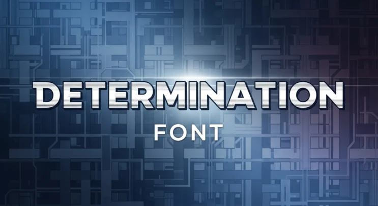
If you’ve spent any time around indie games, pixel art communities, or retro-inspired UI design, chances are you’ve come across the determination font. It’s one of those typefaces that instantly triggers recognition—even if you don’t know its name. Bold. Blocky. Emotional. And deeply tied to gaming culture.
Today, let’s take a clean, honest look at the determination font, what it is, why people love it, where it works best, and where it absolutely does not. No hype. No nostalgia blindness. Just a proper review, tech-blog style.
What Is the Determination Font?
The Determination font is a pixel-style typeface inspired by the indie game Undertale. While the original in-game font is not officially distributed for commercial use, several Determination-style fonts have been recreated by the fan community and are widely used in non-commercial projects.
At its core, Determination is a bitmap font. Every letter is built from visible pixels, not smooth curves. That design choice is not a limitation—it’s the entire point.
This font is about emotion through simplicity.
Visual Style and Design Language
Determination is aggressively minimal. And that’s a compliment.
- Square pixel structure
- Uniform stroke width
- No curves, no flourishes
- Strong horizontal and vertical lines
It feels rigid. It feels mechanical. But somehow, it also feels emotional. That contrast is why the font works so well in storytelling-heavy games.
From a design perspective, Determination communicates:
- Urgency
- Persistence
- Raw emotion
- Retro digital identity
This is not a font that whispers. It speaks directly. Sometimes uncomfortably.
Readability: Surprisingly Solid (With Limits)
Let’s be honest. Pixel fonts are usually a nightmare for long reading. Determination does better than most, but it still has boundaries.
Where it works well:
- Short dialogue lines
- Game UI text
- Headings and labels
- Menu systems
Where it struggles:
- Long paragraphs
- High-resolution web articles
- Print materials
At small sizes, Determination can look cramped. At larger sizes, it shines. This font wants space to breathe—ironically, given how tight its pixels are.
Emotional Impact and Cultural Weight
This is where Determination really separates itself.
Fonts usually serve function first. Determination serves feeling first.
Thanks to its connection with Undertale, the font carries emotional baggage:
- Choice
- Consequence
- Hope
- Persistence
Designers should be aware of this. Using Determination automatically taps into a specific emotional memory for many users. That can be powerful—or distracting—depending on your project.
In tech terms, this font has contextual gravity. You can’t ignore its history.
Use Cases That Make Sense
Determination is not versatile—and that’s okay. It knows what it is.
Best use cases:
- Indie games
- Retro or pixel-art projects
- Fan games and mods
- Game UI prototypes
- Digital posters with a gaming theme
It works especially well when paired with:
- Dark backgrounds
- Minimal color palettes
- Sound or animation
Used correctly, it feels intentional. Used randomly, it feels out of place.
Where You Should Avoid It
Let’s be clear. Determination is not a general-purpose font.
Avoid using it for:
- Corporate websites
- SaaS dashboards
- Blogs with long-form content
- Professional branding
- Academic or business documents
If your product pitch includes words like “enterprise,” “scalable,” or “synergy,” this font is not your friend.
Licensing and Usage Notes
Most Determination-style fonts available online are fan-made recreations. Licensing varies widely.
Before using it:
- Check if the font is free for commercial use
- Read the creator’s license notes carefully
- Avoid official branding or monetized projects unless explicitly allowed
This is especially important if you’re publishing a game or selling digital products.
Determination vs Other Pixel Fonts
Compared to classic pixel fonts like Press Start 2P or VT323, Determination feels:
- More emotional
- Less neutral
- More narrative-driven
Press Start 2P feels arcade.
VT323 feels terminal-based.
Determination feels personal.
That distinction matters.
Final Verdict
The Determination font is not trying to be everything. And that’s exactly why it works.
It’s raw, direct, and emotionally loaded. And in the right project, it delivers impact that polished modern fonts simply can’t.
Rating: 4 out of 5
Use it if:
You’re building something emotional, interactive, or game-related.
Skip it if:
You need flexibility, professionalism, or long-form readability.
Closing Thoughts
Determination is proof that typography doesn’t need complexity to create meaning. Sometimes, a handful of pixels is enough—if they’re placed with intention.
Just remember: this font carries a story. Make sure it aligns with the one you’re trying to tell.